Charanseva eCommerce
Ecommerce. Web Design. Branding
Summary
Charanseva is an innovative ecommerce store that facilitates an online marketplace for footwear retailers and an online shopping website for customers. Several retails can list their products for sale, which has resulted in a large selection of quality footwear for men, women, and children.
The Challenge
This was no yet another ecommerce portal or a marketplace project for us. Charanseva is a unique blend of both the worlds. We were given just the concept. That’s it. Developing the idea was the first challenge we faced. We also required assessing the key elements that would attract customers to buy and at the same time, build trust among retailers to join with Charanseva.
The Approach
We had several discussion sessions to define the idea as clearly as possible. Asking the right questions was the key. As it was a new concept, our team carried out a market research for understanding the user’s perspective on website navigation, information and more. As a result, we used Asp.net to make the ecommerce site responsive that provided a smooth shopping experience.

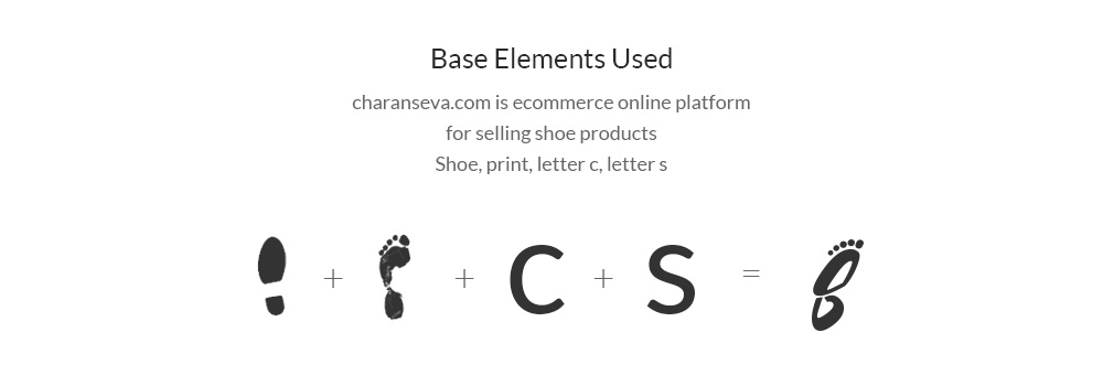
Charanseva means service to the feet. Therefore, the foot & footwear were
creatively combined with the letters in the name. Touch of orange added dimension of fun & affordability.
Final Output


